

A high-end jewelry and accessories brand.
Halo & Flint is a diverse, earth-conscious company focused on designing and crafting jewelry specifically for lesbian and femme-leaning queer women. The goal was to create a visual identity that felt soft, feminine, and approachable—while still carrying subtle cues of intimacy and connection.
Halo & Flint Jewelry Co.
Logo Design & Branding Package
Concept and Creative Direction
The vision behind the logo was to keep things clean and iconic—something that could easily be shortened or stylized in conversation but still leave a lasting impression.
The design started with the idea of two forms intertwined. I used simple typography with long "legs" and sans-serif caps to capture both motion and strength. The goal was to balance elegance with a sense of energy—almost like two figures leaning into each other, graceful yet grounded.


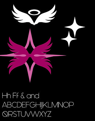
The name “Halo & Flint” draws from jewelry terminology. A halo is a ring of diamonds or stones encircling a larger stone. Flint is a tough mineral known for its ability to spark fire. Together, they symbolize the lasting power of a single spark—eternity born from connection.
The logo builds on this symbolism. I used shapes to echo both a spark or star, and wings, to suggest sanctity and lightness. Paired with a thin, modern typeface, the overall mark feels delicate but strong—a visual statement designed to resonate with queer women and anyone who finds beauty in softness with power.
Final Considerations & Branding
At the end of the day, what’s left is a brand with real staying power. From the emblem-driven logo to the color palette and the marketing choices, everything works together to create a distinct, recognizable voice. It stands apart from others in the same space. Even though it’s rooted in a niche—speaking directly to queer women—it still holds its own as a strong, versatile presence in the broader market. The brand doesn’t just fit in; it makes space for itself.
 |  |  |
|---|---|---|
 |  |  |
 |  |  |

I made this logo for my young nephew, who’s got a seriously strong entrepreneurial spirit. He’s been talking about starting a window cleaning business for a while now, and I figured the least I could do was support that ambition with the skills I have as a designer.
DLC Window Cleaning
Logo Design and Advertising Ideas


Concept and Creative Direction
The logo itself is simple, but effective—bold, clean, and versatile enough to go on anything from flyers and uniforms to magnets and decals. I wanted it to have a kind of timeless quality to it—something that feels intentional and flows well, but isn’t overdesigned. The wave and sparkle elements give it motion and clarity, while the house roofline ties it back to home services in a subtle but clear way.
Final Considerations & Branding
More than anything, I wanted to give him something he could feel proud of and grow with. My hope is that this becomes the kind of mark he can build his business around as it scales—something that sticks.
 |  |  |
|---|---|---|
 |  |

The Freddie Coleman Photography brand was designed to be clean, versatile, and immediately recognizable. The logo uses a bold, structured frame that mimics the shape of a camera — a literal nod to the work itself. Inside, a mix of modern sans-serif typography and a stylized aperture icon in the “O” of Coleman helps visually tie everything to photography without overcomplicating the design.
Freddie Coleman Photography
Logo Design and Branding Expansion


Lets Take a Vote
During the design process, four distinct branding options were developed — each incorporating camera-inspired shapes and visual cues. These ranged from stylized aperture icons to hand-drawn signature typography and modern framing concepts. While we all try not to pick favorites, I couldn't trust myself to be objective as I had a very clear favorite. However, keeping simplicity in mind, the client decided to go with the logo that is now representing them and stated "Well, it looks like a camera and I do photography." Sometimes the right answer doesn't have to be a complicated one.
Bringing it All Together
Ultimately, the branding for this client was created with the sole purpose in mind of creating an internet presence that potential clients of theirs may visit and get in contact. In that endeavor, I believe this serves its purpose quite well. I went ahead and built some additional branding and advertising ideas in consideration of printed material, networking, and additional business development.
 |  |  |
|---|---|---|
 |  |

